
Delicate, but hard to scale.
The old logo feels decorative and soft. Its thin lettering, oversized initial, and tiny medical detail make it difficult to read at smaller sizes or in fast-moving digital contexts.

Before / after rebranding attempt
A visual review of the shift from a delicate, inconsistent identity to a stronger healthcare system built around a clear mark, sharper typography, owned teal gradients, and ready-to-use digital assets.
The rebrand keeps the recognizable Stanford name, but rebuilds the identity around legibility, confidence, and a more flexible medical symbol that can carry the brand across print, social, uniforms, and web.
The old logo feels decorative and soft. Its thin lettering, oversized initial, and tiny medical detail make it difficult to read at smaller sizes or in fast-moving digital contexts.
The new identity uses a bold wordmark and a distinctive mark that blends an S, heart, and care form. It feels more modern while staying close to the healthcare category.
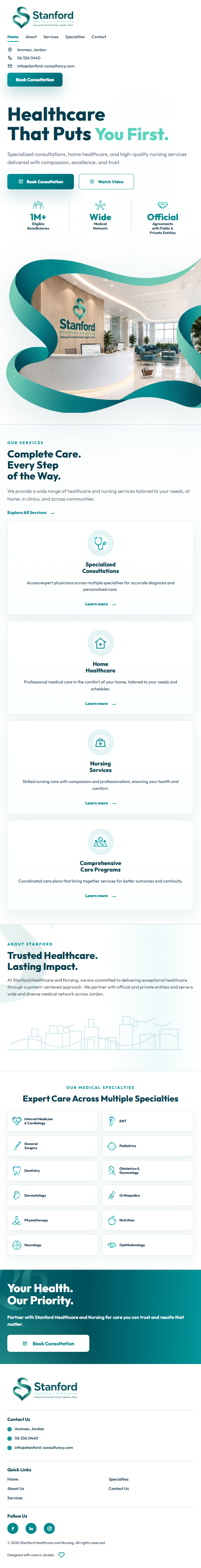
The new website direction introduces cleaner hierarchy, stronger hero imagery, more deliberate spacing, and a visual system that matches the refreshed logo and social assets.
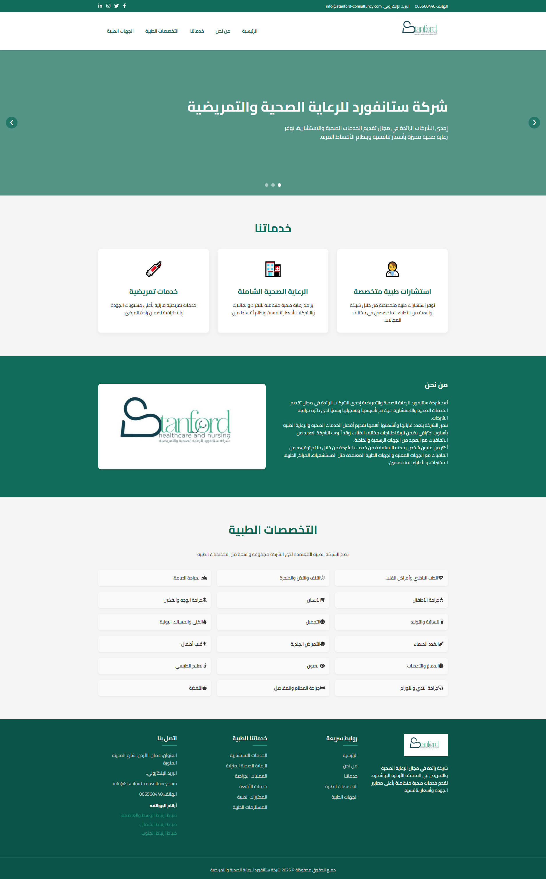
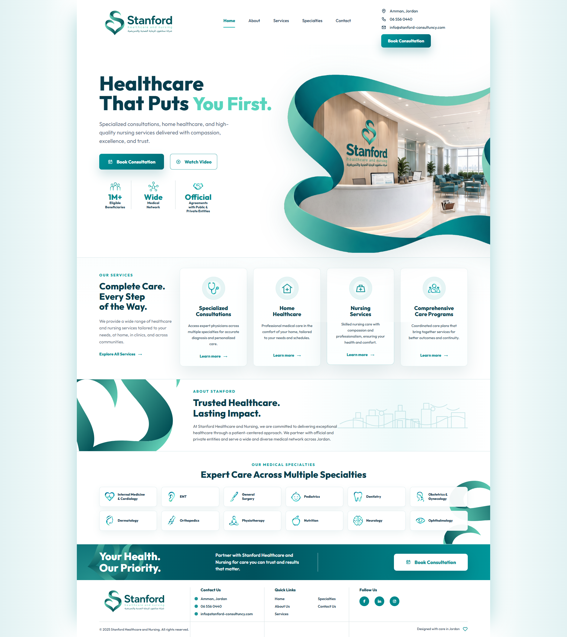

The new icons inherit the same ribbon-like gradient language as the logo mark, making service categories feel connected instead of assembled from generic symbols.
The new Stanford system is not only a logo refresh. It creates a repeatable language for campaigns, service icons, digital screens, and patient-facing communication.
A shift from flat posts to a branded campaign language.
The new social direction uses stronger depth, more controlled typography, and larger brand elements. It makes each post feel connected to the same visual world.
Old design vs new design
The before posts carry the message, but the after posts make the brand itself more memorable.
The refreshed posts work together as a complete profile system.
The mockup shows how the new campaign language holds consistency across the feed, using repeating brand cues, calmer spacing, and a clearer medical identity.